A Friendly Loan App Designed to Build Trust and Financial Confidence
Plus 1
My Role
UI/UX Designer
Time
7 months
Platform
App
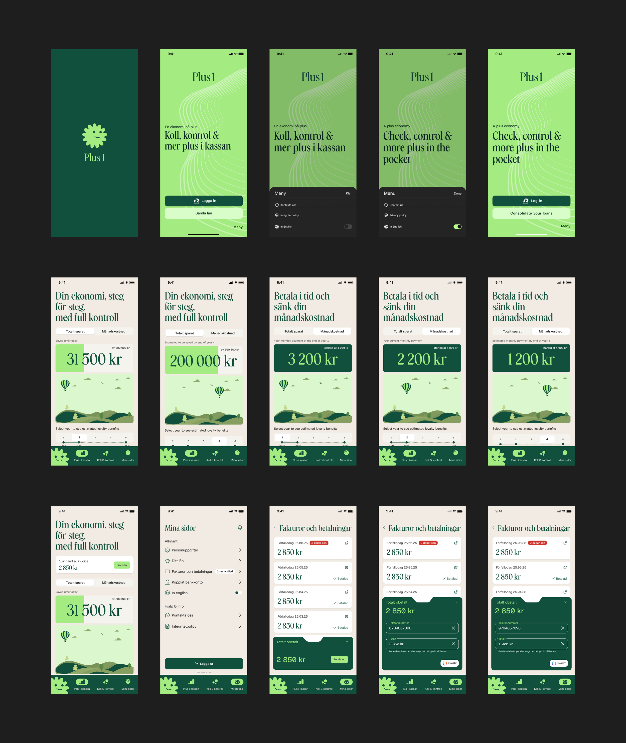
Plus1 is a friendly and transparent loan app that helps people with low credit scores manage their finances more easily. The app simplifies invoice payments, visualizes the user’s financial progress, and rewards responsible behavior.
Overview
Many people struggle with complicated financial apps that make them feel judged or overwhelmed. Understanding loan terms, tracking expenses, and staying motivated to pay on time are common challenges. The goal was to design a simple, human, and supportive experience that helps users feel in control of their money.
The Challenge
The main purpose of Plus1 is to help people manage and pay their invoices easily while staying financially motivated.
Easy invoice payments directly in the app.
Rewards for discipline: Users who pay regularly see their monthly costs decrease every three months.
Visual loan journey: An animated timeline shows how consistent payments lead to savings.
Spending insights: The app categorizes expenses and provides helpful alerts.
Financial guidance: Plus1 acts as a coach, helping users build healthier money habits.
Purpose of the App
User Research
To understand user needs, I analyzed common pain points and behaviors among people managing loans or struggling with credit.
Methods
Competitive analysis of existing financial apps.
Hypothetical user interviews and behavior mapping.
Persona and archetype creation to represent core user types.
Key Findings
1. Financial apps often feel intimidating and judgmental.
2. Users struggle to understand complex terms and interest rates.
3. Motivation increases when progress is visualized and rewarded.
4. Empathy and a friendly tone build trust and engagement.
User Archetypes
1. The Unfortunate - financially stressed, seeking stability.
2. The Impulsive - overspends, seeks quick access to money.
3. The Addicted - trapped in borrowing cycles.
4. The Unexperienced - new to financial management, needs guidance.
Insights & Opportunities
1. Finance feels intimidating → design a friendly, conversational experience with a supportive tone.
2. Loan processes are confusing → visualize progress and repayment through an animated loan journey.
3. Motivation drives retention → reward good behavior with visible savings and achievements.
4. Users differ in needs → tailor tools to archetypes (education, budgeting, motivation).
Design Goals
1. Simplicity – make financial tasks clear and intuitive.
2. Transparency – explain interest and progress visually.
3. Empathy – build a human, judgment-free experience.
4. Motivation – celebrate positive behavior through rewards.
5. Personalization – adapt to different user types and needs.
User Flow
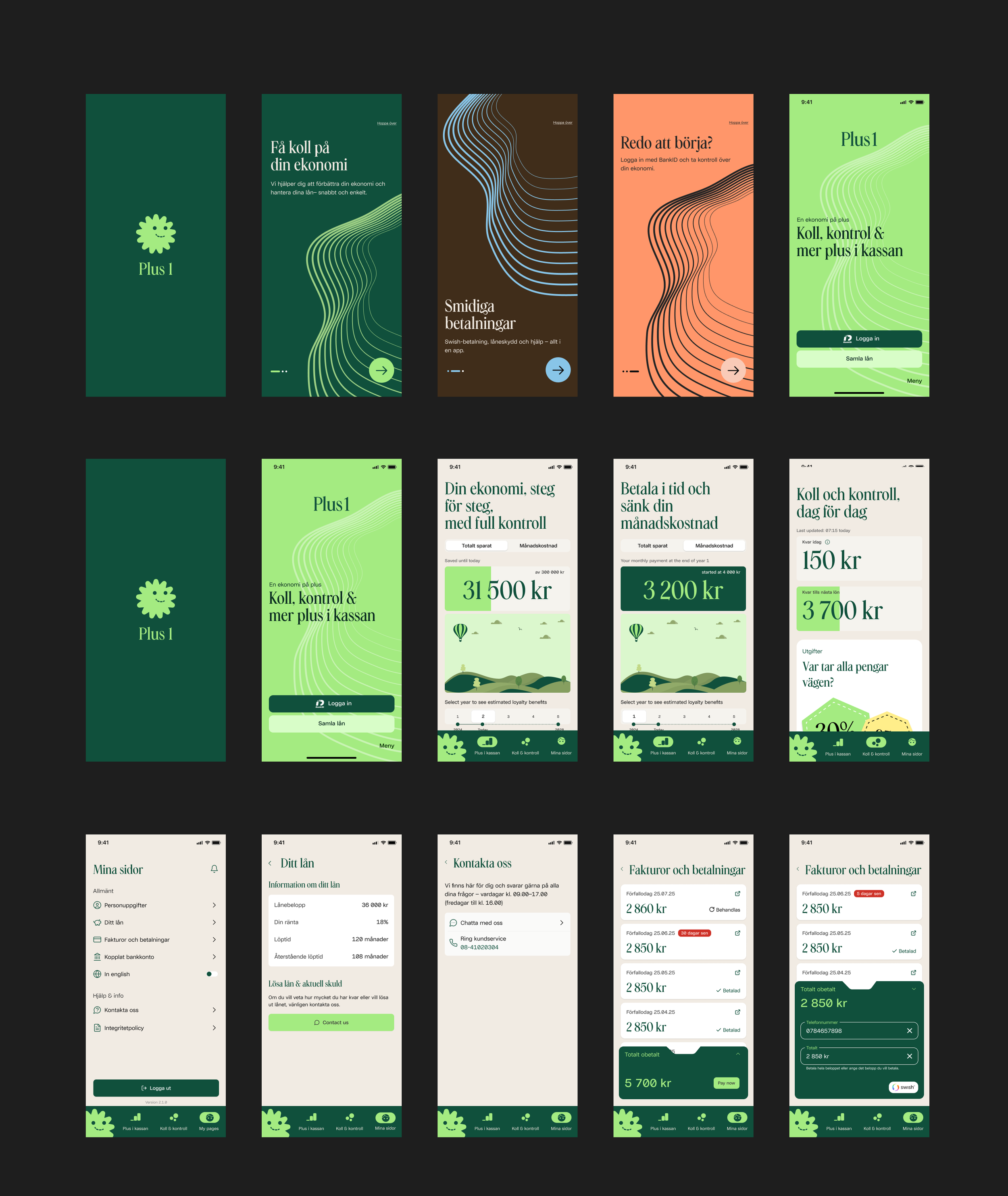
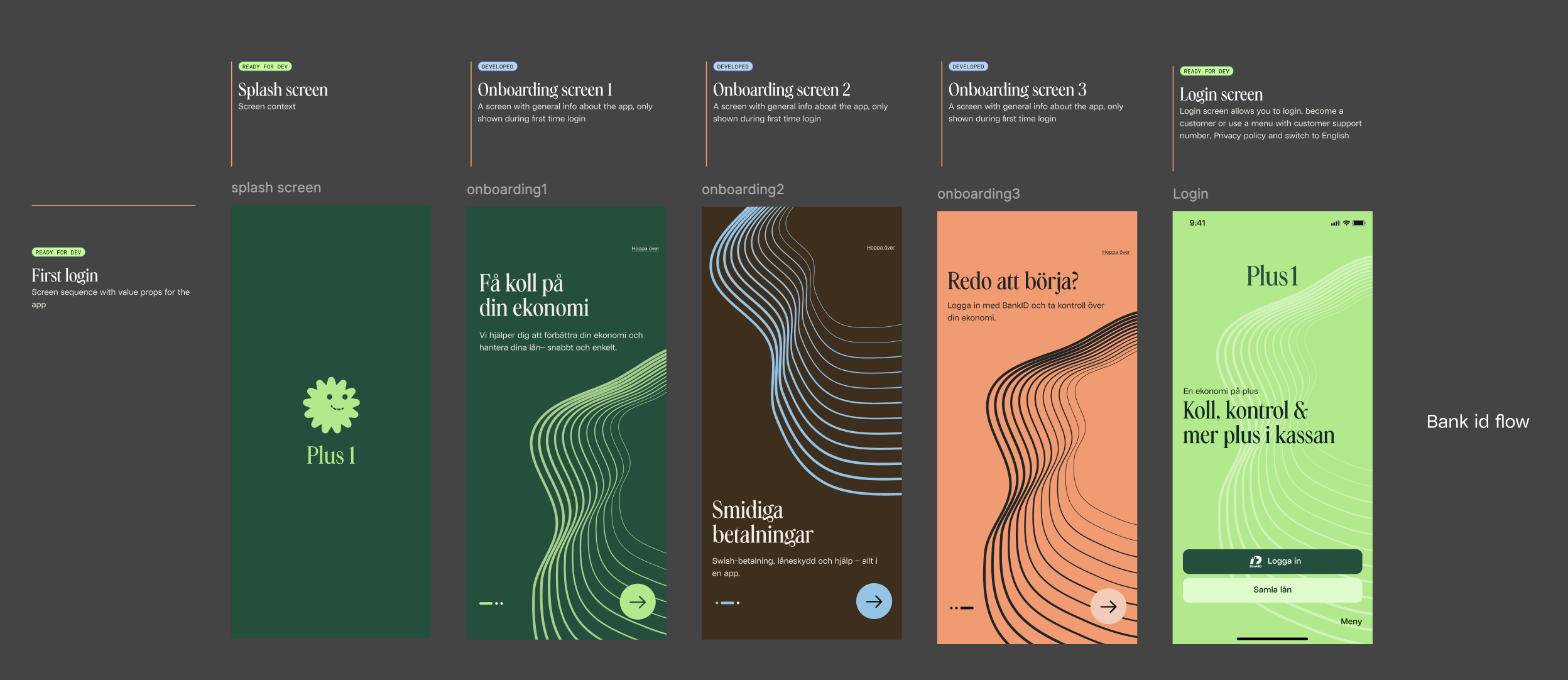
Onboarding flow
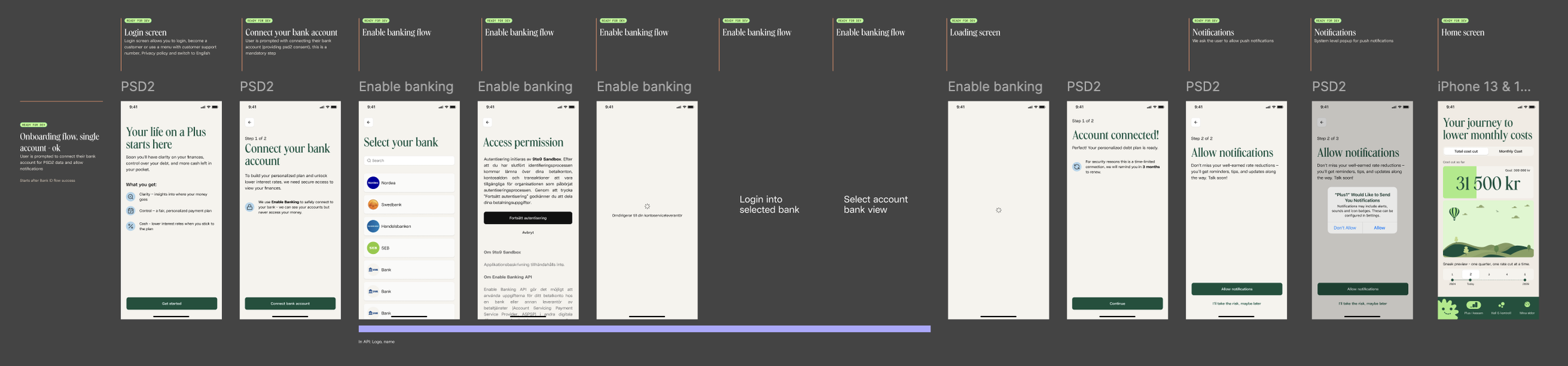
Splash screen → Onboarding screen 1 → Onboarding screen 2 → Onboarding screen 3 → Login screen (BankID) → Connect your bank account → Select your bank → Access permission → Loading screen → Account connected → Allow notifications → Home screen
PSD2 — Bank Connection Renewal Flow
Reconnect your bank account → Select your bank → Access permission → Loading screen → Login into selected bank → Select account bank view → Account reconnected → Allow notifications → Home screen
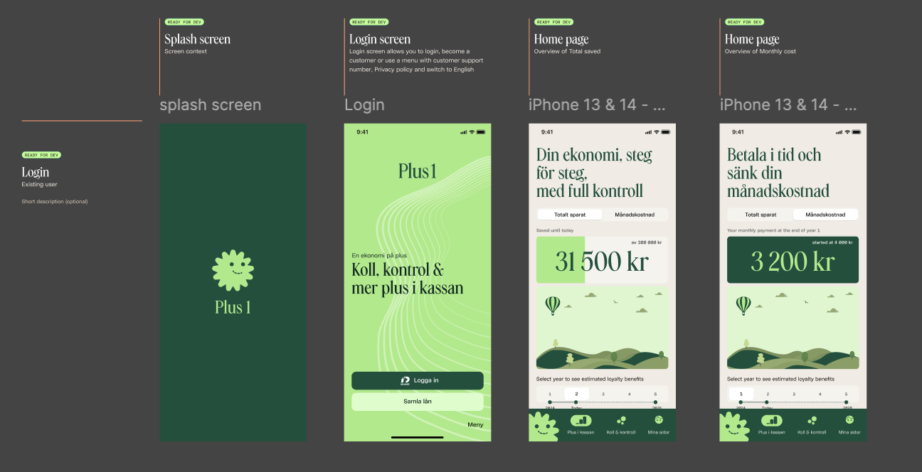
Login & Access Flow
Splash screen → Login screen (BankID) → BankID authentication →
→ Home screen
→ Error screen (retry login)
→ Menu (Change language / Contact us / Privacy policy) → External link opens
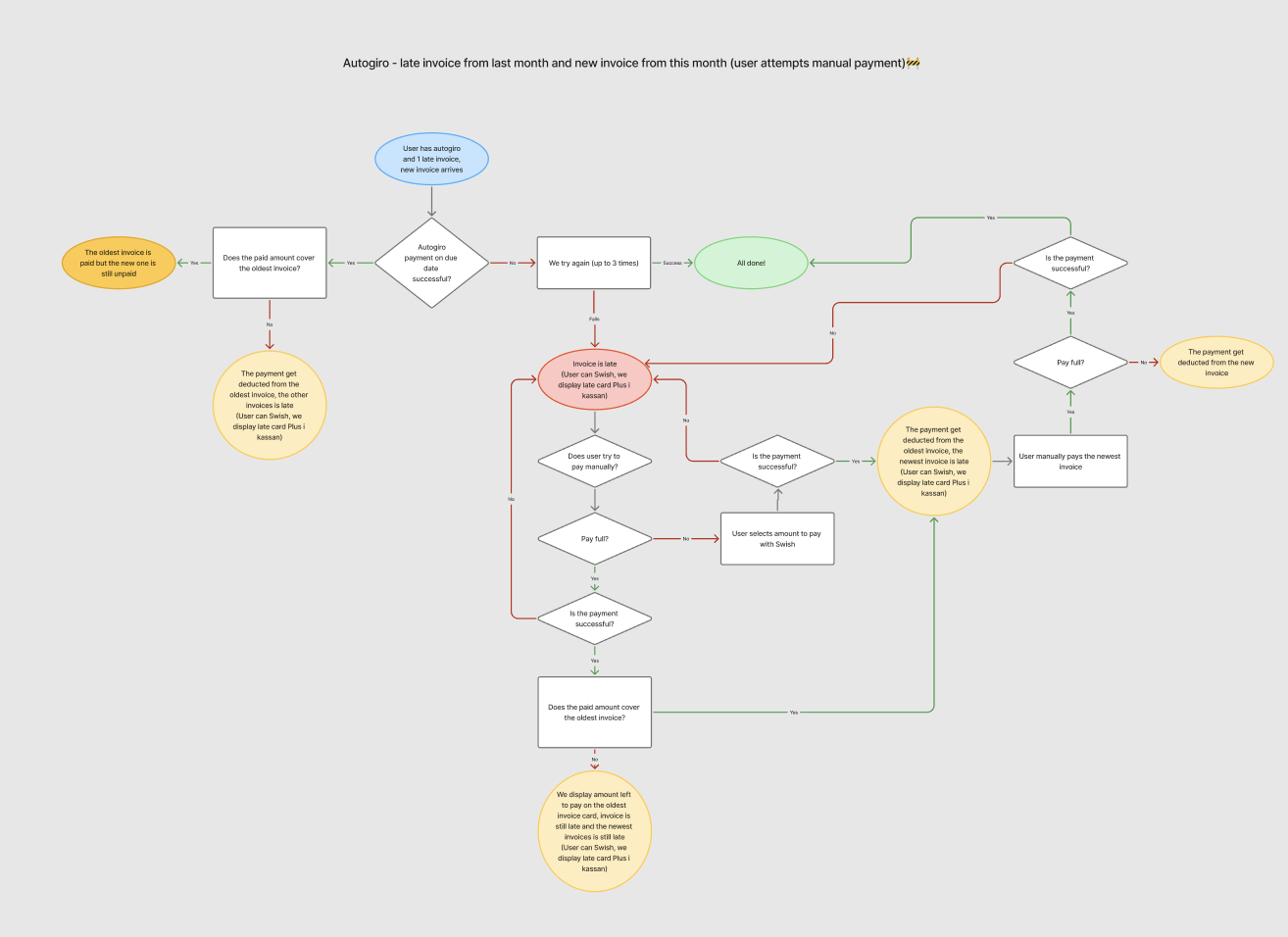
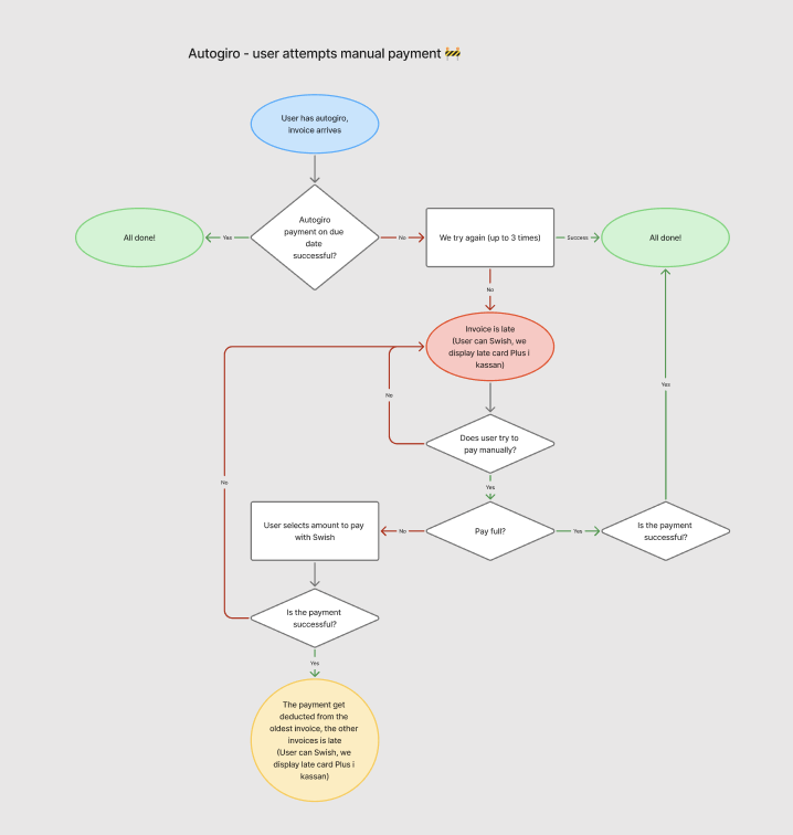
Payment flows

Visual Design
The final design balances clarity and empathy.
Plus i kassan: visualizes progress and interest rate reduction.
Koll & Kontroll: breaks down spending into categories with charts and badges.
Mina Sidor: gathers notifications, invoices, Swish payments, and settings.
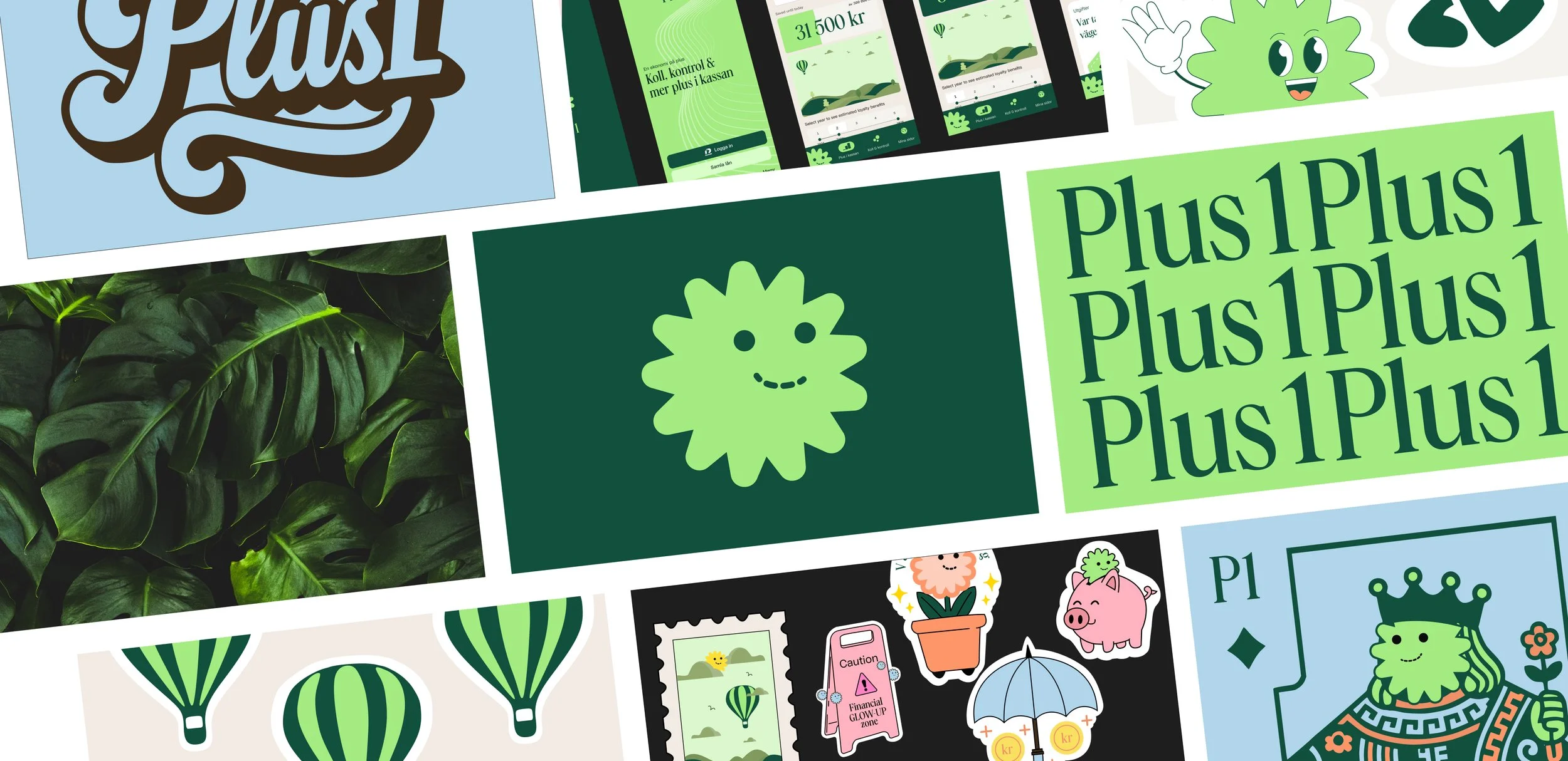
An eye-catching color palette and soft typography were used to create trust and comfort.
Design System
Colors:
Primary Colors
Deep Green
#10503C— brand color used for buttons, icons, and main call-to-actions.Lime Green
#A4EB81— accent color for highlights, success states, and visual positivity.
Secondary Colors
Warm Brown
#402D1A— supporting tone used in illustrations and secondary backgrounds.Sky Blue
#88C5E8— used in UI elements and charts.Coral Orange
#FF966A— highlight for warnings, promotional details, and UI contrast.
Neutrals
Almost Black
#101010— used for main text and ıcons.
Typography:
GD Flow, GD Gaio - Inter
Components:
We used React Native Reusables components for cards, buttons and custom components to ensure clarity and friendliness across the interface.
Final Stage Designs